Vladimir Lenin was the first head of Soviet Russia after the October revolution. Lenin believed Russian culture was at the heart of a strong nation. From 1919 to 1929 artists in Russia received relative freedom to experiment with art in order to conceive a distinct Soviet style. Lenin wanted art to be ‘accessible’ to the proletariat.
Productivism and Constructivism were new forms and ideas in visual art in post revolution Russia. Constructivism questioned the role of art in society. Working along side the principles of communism, the constructivists aimed to work as a collective. They believed in equality of the sexes making it one of the first times female artists were valued as highly as men. They took a scientific and very rational approach to art, wanting to contribute to every day life through design, architecture etc. (similar Bauhaus principles – see post).
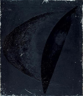
Alexander Rodchenko and Liubov Popova were two of the founders of the constructivism movement. They worked across a number of fields including graphic design, advertising and theatre. Rodchenko was a very experimental artist. Much of his work is abstract, he experimented widely with texture, surface and colour. His experimentation with colour lead to a series of works which eliminated colour and focused solely on the textures and surface used.
Alexander RodchenkoBlack on Black from the series 'Black on Black' 1918
References
Russian formalism By Victor Erlich
http://www.bbc.co.uk/history/historic_figures/lenin_vladimir.shtml
http://en.wikipedia.org/wiki/Proletkult
http://www.tate.org.uk/modern/exhibitions/rodchenkopopova/
16 May 2009
14 May 2009
The Bauhaus (in brief!)
The founder of the Bauhaus (1919-1933) was an architect named Walter Gropius. At the time Germany was experiencing cultural and political upheaval; despite the Bauhaus revolutionary approach to teaching art Gropius maintained that the Bauhaus was unpolitical.
The ideals of form following function were part of the distinctive Bauhaus style. Modernism was a huge influence on the approach of designs. Gropius wanted to reunite craft with art thus creating highly functional beautiful consumer goods that could be easily mass produced. The unique Bauhaus style was also influenced by De Stijl. Johannes Itten taught at the Bauhaus; he developed the course which students would begin at their start of their studies its emphasis being on unusual uses of common materials. Itten eventually left the Bauhaus due to disputes with Gropius over teaching methods (use of meditation and eastern mysticism). Itten's departure marked a turning point in the whole ethos in teaching at the Bauhaus, Gropius wanted to further the ideas he favoured of Russian Constructivism. Itten was succeeded by Moholy-Nagy. For the showcase of the schools new ideas a house was designed, built and furnished as a model modern home. A new location for the school was founded in Dessau, 1925. The Bauhaus was fulfilling the ideals Gropius had intended and the school enjoyed a few years of success. But, with Nazism in the ascent, political pressure mounted, and in 1928 Gropius left. His successors, Hannes Meyer and Mies, spent their leaderships hindered and caught up in political friction.
References
http://en.wikipedia.org/wiki/Bauhaus
http://www.tate.org.uk/collections/glossary/definition.jsp?entryId=40
http://www.designicons.co.uk/
Bauhaus Dessau: Walter Gropius - Dennis Sharp
13 May 2009
Ed Fella
Ed Fella has worked across a number of fields within the art world. He begun his career working in the commercial world of advertising but now works in education. His work in graphic design and typography is unique and very distinctive; he is an established and impressive post modern artist. Fella’s work has embraced the postmodern concepts of deconstruction, he mixes high and low culture trends throughout his work.A lot of his works are cluttered pieces of typographic design that mix hand written fonts of different sizes and layouts, colours and shapes together, I think they are like perfected doodles.
Ed Fella’s personal approach to typography is bold and daring, his work has featured in Raygun magazine and it definitely falls into the same genre of artists that worked on their covers; very experimental and unconventional. Half of issue 17 of Émigré magazine is devoted to Ed Fella. His font designs are still featured by them. He blurs the divide between graphic design and art; this is certainly evident in his collages that are beautifully composed pieces of typography and art.
References
Ed Fella: Letters on America - Lewis Blackwell
Semiotics
Semiotics is the study of signs; their meaning, significance and purpose. In day to day life we are bombarded with images (or signs) that may order, direct or explain without the use of much text or none at all. In a society where advertising is constantly surrounding us we have learnt to connect certain feelings, emotions, and desires with the use of specific visuals (often subconsciously). Advertisers can use this to create catchier shorter methods of passing information to the consumer. It also allows for them to catch their target market quickly and efficiently.
Not all semiotics are linked so directly to advertising. Colour is a good example of the use of semiology. For example blue representing cold and red as hot is found on almost all taps internationally. Road signs are also designed to communicate without the need for text or lengthy explanation. Drivers quickly become accustomed to road signage.
Of course it could be that a semiotic technique used in one country could change or loose meaning (importance) in another for example the use of a particular colour as bad or dangerous. However through our ever more connected world most common signs (green man crossings, buttons on electrical equipment) can be used across the world, allowing for better trade and improved communication between cultures.
References
http://www.aber.ac.uk/media/Documents/S4B/sem02.html
Mythologies - Roland Barthes
http://www.isisemiotics.fi/
12 May 2009
Gilbert and George
Gilbert and George are unique contemporary artists with a distinctive style.
I have always liked the atheistic appearance of their work. The vivid bold colours used in their large scale pictures are particularly striking. Producing pictures that are made up of large black lined frames or cells placed together (there is a stained glass effect) they bear a resemblance to church windows. Gilbert and George have always said they do not believe in religion, but religious ideas and taboos are a common part of their work. They tackle social subject matters, through their belief that art should be for everyone. This has sometimes been interpreted in a very negative way, for example the work ‘Paki’ has been said to glamourise skinhead culture.
Their work is clearly very personal. They do not appear to hold back their thoughts and feelings in terms of expression, the work can be very explicit which of course will create controversy. They have used urine, semen and excrement for pieces of work. My opinions on this are similar to those on Toscani and the issues of using shock to create attention and whether it is necessary. Personally I think their work is amusing rude and clever.
References
Evening Standard - Monday 11th May 09
10 May 2009
Ray Gun (magazine)
Raygun was an alternative rock roll magazine that was first published in 1992. The magazine was markedly set apart from others of the time and still today (despite experimental design seen more often) the designs are unique, have remained popular and are being discovered by a new generation.
Whilst researching Raygun I was drawn to the recognisable and distinct cover design. They can, at first glance, appear jumbled cluttered and often illegible however there is amazing talent in the way the have been composed, the typography is particularly beautiful with the use of experimental abstract fonts and wording.
David Carson was art director of Ray Gun, his non traditional approach to graphic design was a perfect match for Raygun style. Many of the covers have surreal feel to them with an article starting on the cover or interviews that were purposely covered by a photograph.
Raygun did not only have cutting edge design but also featured many bands and music artists that had not yet been recognised by other big magazines such as Rolling Stones.
References
http://en.wikipedia.org/wiki/Ray_Gun_(magazine)
Ray Gun, Out of control - Marvin Scott Jarrett and Dean Kuipers
http://www.chris-ashworth.com/ray-gun-publish/ray-gun-magazine-covers/
http://en.wikipedia.org/wiki/Ray_Gun_(magazine)
Ray Gun, Out of control - Marvin Scott Jarrett and Dean Kuipers
http://www.chris-ashworth.com/ray-gun-publish/ray-gun-magazine-covers/
Subscribe to:
Posts (Atom)